Category Archives: Uncategorized

Blog 5 – Dale Murray – Emre Arolat Architecture – Sancaklar Mosque

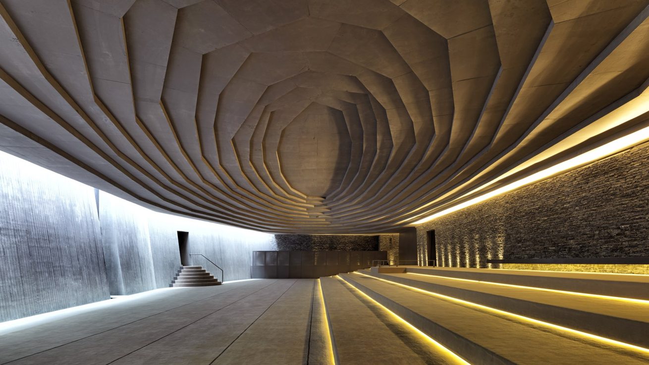
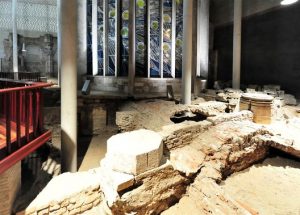
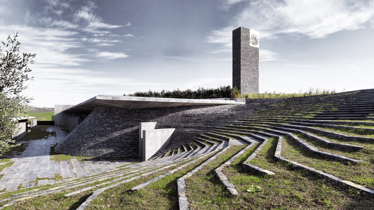
This is a mosque was designed by Emre Arolat Architecture by request of the Sancaklar Family who wanted a mosque overlooking the Buyukcekmece Lake just west of Istanbul Turkey. The mosque is embedded into the side of the hill so as to preserve the sense of belonging that this structure is part of the hill itself. The outside of the mosque is also built with light grey stone to further preserve the sense of nature and simplicity. The interior of the mosque is built in such a way that it seems to resemble a cave with its cascading stone ceilings and solid rock walls with soft lighting so as to create a feeling of peaceful worship. Due to the structure being made of natural materials and built partially within a hill is has natural insulation against heat transfer so as to lower energy costs.

Blog 8- Lisa Ratliff- The Cave House (Tulsa, OK)

Every time I drive by Riverside, I go by The Cave House. As a little girl, I have always wondered why. It was so ugly, tiny and unattractive. The white peaking of the cement with the paralleled stones in the front mirroring one another is so odd. I have gotten close to the house and it honestly creeps me out.  I wish there were more square structures on the home because I actually like the left side which is more modern. But the stone-like accents really throw off the appeal.

Tulsa history has it that the house was created as a hip restaurant and then speakeasy during prohibition. The architect was Daniel Eichenfeld, and it was built by Joseph Koberling Sr. – father of art deco architect Joe Koberling Jr. who was also a geologist. It was made in the 1920s to resemble a cave at the bottom of a rocky hill.

Although the place is ugly, it has a weird charm that I think attracts many tourists. The owner of the house will give tours for $10 a pop! I personally have never toured because I do not think it is worth it but I think if someone was intrigued by odd buildings, this would definitely be it!

HERBERT SMITH FREEHILLS LAW LIBRARY IN SYDNEY, AUSTRALIA- FJMT, ARCHIMEDIA (BLOG 8)

I decided to add another library by FJMT because it is interesting the two structures they went with.  In my blog 7, the library they designed was designed for the use of the general public. This library was designed for the use of students at the University of Sydney. It is a complete redesign from the other and I believe it incorporates the Universities style into its design. It is small yet open due to the use of glass in this project and takes over every ones point of views while walking by with its unique structure. There is nothing else like it in the world.

Blog 7- Lisa Ratliff-National Museum for African American History and Culture (Washington D.C.)

I was lucky enough to see this building in person last year when I went to visit Washington D.C. It is very unique and the outdoor metal work is intricate with such a rich history. It was created by lead designer David Adjaye and lead architect Philip Freelon, with their architectural team Freelon Adjaye Bond/SmithGroup.

The  form of the museum is inspired by the three-tiered crowns used in Yoruban art from West Africa. The wrapping of the entire building in an ornamental bronze-colored metal lattice, the architect pays homage to the intricate ironwork crafted by enslaved African Americans in Louisiana, South Carolina, and elsewhere. As seen in the above picture, the inside is beautiful too, with natural light penetrating the inside of the building, peeking though the ornamental lattice. 

At night, the building glows with an iridescence that is mystifying. Right next to the Washington monument it does not overshadow but beams with light just as the bright monument. Although the building is seemingly opaque during the day, the designers and architects did an incredible job letting the ornamental lattice shine day and night on the building.

MAX WEBER LIBRARY, BLACKTOWN- FJMT, ARCHIMEDIA (BLOG 7)

This beautiful library makes its home in Sydney, Australia. Just from the outside view, you can see how its luxurious design can make you feel. To me, it looks like no other library I have ever seen before and it would draw me to it in order to get work done. The first thing I notice that is important for a library to have is a lot of open space and windows. This allows the people inside to feel open and less trapped. The design feature and all glass exterior and from the outside in you are able to see the many sitting points they have available. I would love to be able to walk in this place one day.

MACARTHUR MEMORIAL PARK- FJMT, ARCHIMEDIA (BLOG 6)

This is another project the firm worked on. It is a beautiful and stunning piece that portrays exactly what it is supposed to. With it being a memorial, they offer very soft lighting under neath where the names are portrayed in honored memory. With it being outside, it offers a freeing feeling to the viewers along with water to offer the viewers a feeling of tranquility. All these parts play a huge role into the beauty of the project.


Business School and Teaching complex- FJMT, ARCHIMEDIA (Blog 5)

This building is a business college in New Zealand that made FJMT famous. FJMT is a firm “dedicated to design excellence and the enhancement of the public domain”(FJMTStudio.com). The business school is a wonderful example of a stunning piece of architecture that draws eyes to its minimalist yet complex design. It also incorporates a stunning amount of natural light with the amount of windows used on this project. I must say, going to school here looks like it would bring happiness with it. It is important to not as well that as you look to the front of the building, it overlooks the Auckland Harbor which the firm brings to life with the building.


Blog 6- Lisa Ratliff-Science Museum Oklahoma (Oklahoma City, OK)

The Science Museum Oklahoma is a children’s museum located in Northern Oklahoma City. Although it has been around for more than 30 years, the museum got a 12 million dollar upgrade for a new outdoor and indoor experience. Rand Elliot Architects redesigned the front by adding vertical columns and a colorful blue glass outdoor hall. Another reason for redesigning this side of the building was that the Omniplex was no longer in use so they needed to change the entrance.

This museum is closer to my heart than most peoples’ because I work here currently. I mitigate schoolchildren around the museum and ensure their safety. It is a great place to work with a beautiful interior space. Aside from the entrance, the right-wing of the museum is also stunning. It has a sharp glass panel that sits vertically against the building. This is similar to the Perot Museum in Dallas. I think that the sharp glass element next to a boxy structure does add a curious and sciency look to the building. Also compared to the Perot Museum, the Science Museum also used a metallic looking material that gives off a futuristic and robotic feel to the building that definitely goes appreciated. 

Blog 8: Carme Pinos

some LANDSCAPES: Igualada Cemetery

Carme Pinos is a spanish Architect, who is widely known for designing the Igualada Cemetery. This cemetery is one of the most poetic works of architecture in the 20th century. Enric Miralles, who also helped design the cemetery along with Pinos was buried in this cemetery after his death in the year 2000. Their design was an attempt to link the cycle of life with the past, present and future. I believe they did a great job because it looks like a real city of the dead. I think they did well provoking the thoughts and memories of people who visit this cemetery.

Kyleigh Earl Blog 1- Peter Zumthor

The Kolumba Art Museum of the Cologne Archdiocese– Peter Zumthor, Cologne, Germany

The Kolumba Art Museum is located in Cologne Germany, and it houses the large art collection of the Roman Catholic Archdiocese (Cilento 2010). Cologne was ravaged by WWII, and this museum sits on the site of a late- Gothic church. Zumthor, like in many of his architectural projects, used fragments and stone ruins from the church that used to stand in its place in the construction of the museum to preserve the historical significance of the area. The entirety of the building is made of a custom grey brick, which makes the museum very contemporary in appearance, but also peaceful.

The museum has 16 exhibition rooms, and a garden courtyard at the center. Because of the grey brick making up most of the infrastructure, it seems pretty plain and simple on the inside, but being a museum, its appropriate because the art should be the main focus. The lighting throughout is more diffused with spotlights on the art pieces, giving the building an overall ethereal and spiritual feeling, which is to be expected due to the art being from the Archdiocese.

Cilento, K. (2010, August 6). Kolumba Museum / Peter Zumthor. Retrieved from https://www.archdaily.com/72192/kolumba-musuem-peter-zumthor

All of the photos are from the above article, taken by Jose Fernando Vasquez in 2007